maandag 29 juli 2013

Week 29-back to color


In week 28, I was totally inspired by Trisha Harrisson & Annette Haring to use lots of whites an print photo's ready to go. It was really easy putting together that week, just slipping the photo's in the pockets and done! And it did not look to bad either.

So I did the same with my pictures for week 29.
However, when they arrived, I was kind of sad about finishing the week so quickly and not having any of the paper-cutting, sticking-things-on kinda fun that I got out of the more colorfull pages.
And my Project Life album looked more like my photo albums do: they are clean and white with large pictures, focussing really more on beautiful images than stories.
So, I cut all the prints up again :)


As I had originally printed them in white templates with a small line of text underneath, and it seemed a waste not to use it, I cut the journaling out as well and used that in the spread.

Turns out I like that most about the whole spread!

So, as my goal for 2013 (my first PL year) is to find my own style, I can now safely say all white is not it.

One thing I started doing recently and liked ( so I am going to keep doing it) is use a picture for the weeknumber card.

I just pick a general picture, or one that captures the week somehow ( or shows off my tan) and add the week number & dates. This way you do have a week number in your spread, but you do not have to sacrifice picture-space.

So at least I have "weeknumber cards" covered. Now onto finding the rest of my style. 23 more weeks to do so (doesn't time fly??)


donderdag 25 juli 2013

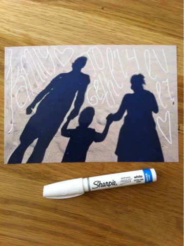
Sharpie love!

I am just in love with my new white sharpie pen! I usually put white text on my pictures in Indesign, which works great.
But now there is a whole new player in town! With my Sharpie I can draw my own words! Whoopie! 

So love this! Hope to show more soon!

Oh, and the picture above is from my other new love: inserts. More on that soon!

donderdag 11 juli 2013

"This is me... @2"

I have read a lot of posts and saw even more pictures of everybodies "this is me" class projects. Loved all of them. Wanted one of my own.
But, I decided to do it just a tiny bit different.

Using a Simple Stories Sn@p binder & pageprotectors and Becky Higgins Project Life Core Kit Honey ( my absolute favorite one now!) I started a "This is me @2" album for my now 2 year old son.

It features his friends,

favorite toys, favorite tv shows, favorite foods...

... Basically all those things that are going to be totally different by next week :)

My plan is to to this again when he is 3, and 4, maybe even 5. So that he will always have 

dinsdag 2 juli 2013

Keep calm & continue Project Life

During my first half year (5 months actually, as i started in Febuary) i have made layouts that are very different from eachother. Guess I am trying to find out what my style is. I will let you know when I have found it :)
One thing I always did, was decide on the colorscheme of the LO based on the pictures I wanted to use. 
Sometimes that works out great:


In this LO I loved how the right and left side turned out individually, but also as a spread.


However, some weeks I just don't see a particular color standing out. Or it all just does not seem to go together, no matter how many kits I have to my disposal. (5, just in case you were wondering).

Wonder what you guys do with these though weeks...